We’ve worked with countless roofing companies, and one thing is always clear: a strong logo can make or break a business. Studies show that 75% of homeowners judge a roofing company’s credibility based on its logo alone. First impressions matter, and in an industry built on trust, a polished, professional logo can set you apart from the competition.
Understanding the Psychology Behind Successful Roofing Logos
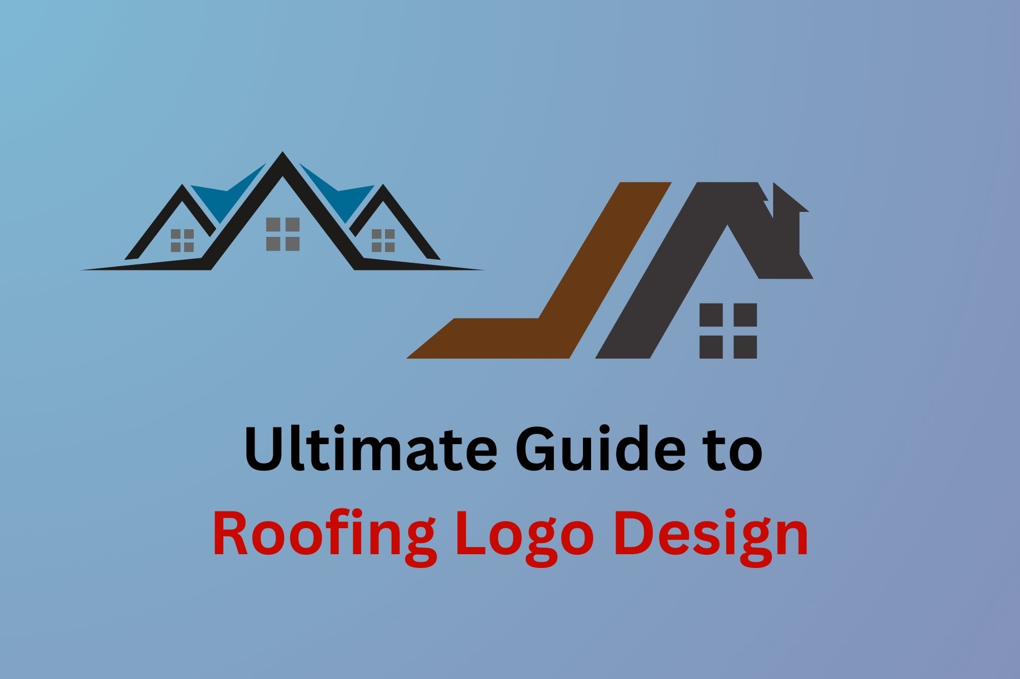
Think about the most well known roofing companies in your area. Notice anything similar about their logos? Most stick to deep blues, strong grays, or earthy browns, colors that naturally make homeowners feel secure and confident.
Color psychology isn’t just marketing jargon, it’s a proven way to influence customer perception. Your logo should reinforce your company’s reputation for strength, dependability, and professionalism.
Essential Elements of an Effective Roofing Logo
A great roofing logo isn’t just about looking nice, it needs to be functional. Here are three key elements that can make or break your design:
1. A Clear, Recognizable Symbol
Your logo should immediately tell people what you do. we had a client whose roofing logo featured a detailed Victorian house. It was beautifully designed, but when shrunk down for business cards or embroidered on uniforms, it turned into an unrecognizable blur. Simple, bold roof lines or shield shapes tend to work much better.
2. Readable, Strong Typography
Picture your logo on a truck driving down the highway at 60 mph. Can someone read it? A client saw his leads double after switching from a fancy script font to a clean, bold typeface. Your name should be easy to read from a distance, on signs, uniforms, and marketing materials.
3. Smart Color Choices
Your colors need to work everywhere, from digital ads to yard signs. Dark blue paired with silver or copper accents is a winning combination that has worked well for many of our clients. Stick to a limited palette to avoid printing issues and visual clutter. you can use coolors service to help you choose your roofing business color palletes
Step-by-Step Guide to Creating Your Roofing Logo
1. Gather Inspiration
Start by taking a look at what’s working in your market. Snap photos of competitor logos you like (and ones you don’t). This will help you understand what appeals to your target audience.
2. DIY vs. Professional Design
There are plenty of DIY design tools like Canva, but we’ve seen many companies waste months tweaking a logo, only to hire a professional later. If you’re serious about your business, it’s worth investing in a designer who understands the roofing industry. Your brand should resonate with homeowners dealing with storm damage or leaks, not look like a tech startup.
Common Roofing Logo Design Mistakes to Avoid
After years of consulting, I’ve seen some costly logo mistakes that are easily avoidable:
-
Overcomplicating the Design – If your logo is too busy, it won’t scale well. A local roofer once showed us a logo featuring three different roof types, his phone number, and a tagline. It was unreadable on his trucks. Simple is always better.
-
Using Too Many Colors – Every extra color increases printing costs and makes branding inconsistent. Stick to two or three max for a clean, professional look.
Implementing Your Roofing Logo Effectively
Once you have a great roofing logo, consistency is key. we recently visited a roofing company that used three different versions of their logo, one on their trucks, another on uniforms, and a completely different one on their website. This inconsistency can make a business look unprofessional.
To keep your branding strong, create a simple brand guide that includes:
-
Exact colors for printing and digital use
-
Minimum logo size requirements
-
Rules on where and how to use your logo
-
Which versions are approved for different platforms
Final Thoughts
Your logo isn’t just a design, it’s an investment in your company’s future. We’ve seen too many roofing businesses cut corners on branding, only to realize a year later that it is actually costing them jobs.
Think about it this way: If a homeowner is comparing two equally skilled roofing companies, they’ll almost always go with the one that looks more professional. Your logo plays a huge role in that first impression.
So take the time to get it right. If you’re unsure about your current logo, feel free to book a free consultation, we’d be happy to give you some feedback based on our experience. Sometimes, a small tweak can make a world of difference.